Redesigning our own site here at 3P was a reminder that good web design doesn’t stay the same over time. The standards for what looks current simply move, year over year, independent of whether any particular site keeps pace. A homepage can stay exactly the same while the baseline around it changes entirely.
To highlight the evolution of web design we decided to study another website to point out the minor changes over time that led to the site being what it is today. The subject of our study today is the homepage of the San Diego Zoo.
Here's the same page in 2016, 2021, and 2026.
2016: Everything, All at Once
TEN YEARS AGO
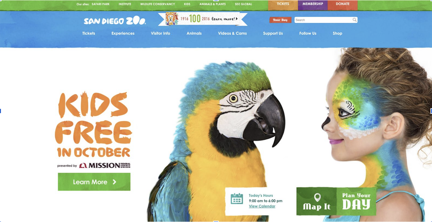
The first thing this page does is talk to several audiences at once, loudly:
- Two navigation bars, stacked. A thin utility strip listing the organization's other properties (Safari Park, Institute, Wildlife Conservancy, etc.) sits above a heavier bar with eight more links.
- Three color-blocked Call-To-Action buttons. Tickets, Membership, and Donate, each a different color.
- A centennial ribbon graphic wedged into the header as its own object, competing with the search bar next to it.
- A collage hero, not a photo. A macaw and a face-painted child assembled against a white void, "KIDS FREE IN OCTOBER" stamped across it in a bold display font, sponsor logo included.
- Three mismatched utility widgets below the fold: “Today's Hours, Map It, Plan Your Day” each its own color and shape.
All of this is to be expected of a 2016 website, it's exactly what a corporate site looked like that year: dense, promotional, built around the assumption that more visible options meant more conversions. As time has gone on, we’ve realized that streamlining your homepage with less clutter and more clarity helps retain visitors.
2021: A Focus on Simplification
FIVE YEARS AGO
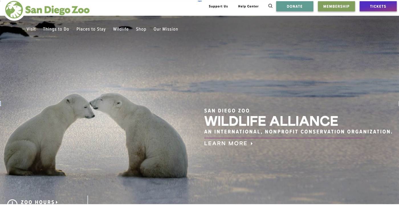
Something structural happened between these two shots, visible before you read a word of copy:
- Two navigation bars became one — a single row of six labels: Visit, Things to Do, Places to Stay, Wildlife, Shop, Our Mission.
- The wordmark logo became a simple circular icon mark next to cleaner type.
- The composited hero became a single full-bleed photograph — with one short, restrained line of type over the darker half.
- Three competing CTAs became one. The header buttons (Donate, Membership, Tickets) are still color-differentiated, but unified into a shared visual language: consistent padding, consistent radius, a calmer teal-green-purple trio instead of 2016's primary-color clash.
- The mismatched utility widgets are gone, no longer distracting from the primary information.
The page stopped trying to be a brochure and started trying to be a photograph with a purpose.
By the early 2020s, full-bleed photographic heroes with minimal text had become the default.
- Web designers began to use one photo that could scale from phone to widescreen.
- Industry-wide analytics showed pages with one clear action outperformed pages with five competing ones.
The new redesigned page had a clarity of purpose and navigation lacking from the 2016 site.
2026: Refinement, Not Reinvention
TODAY
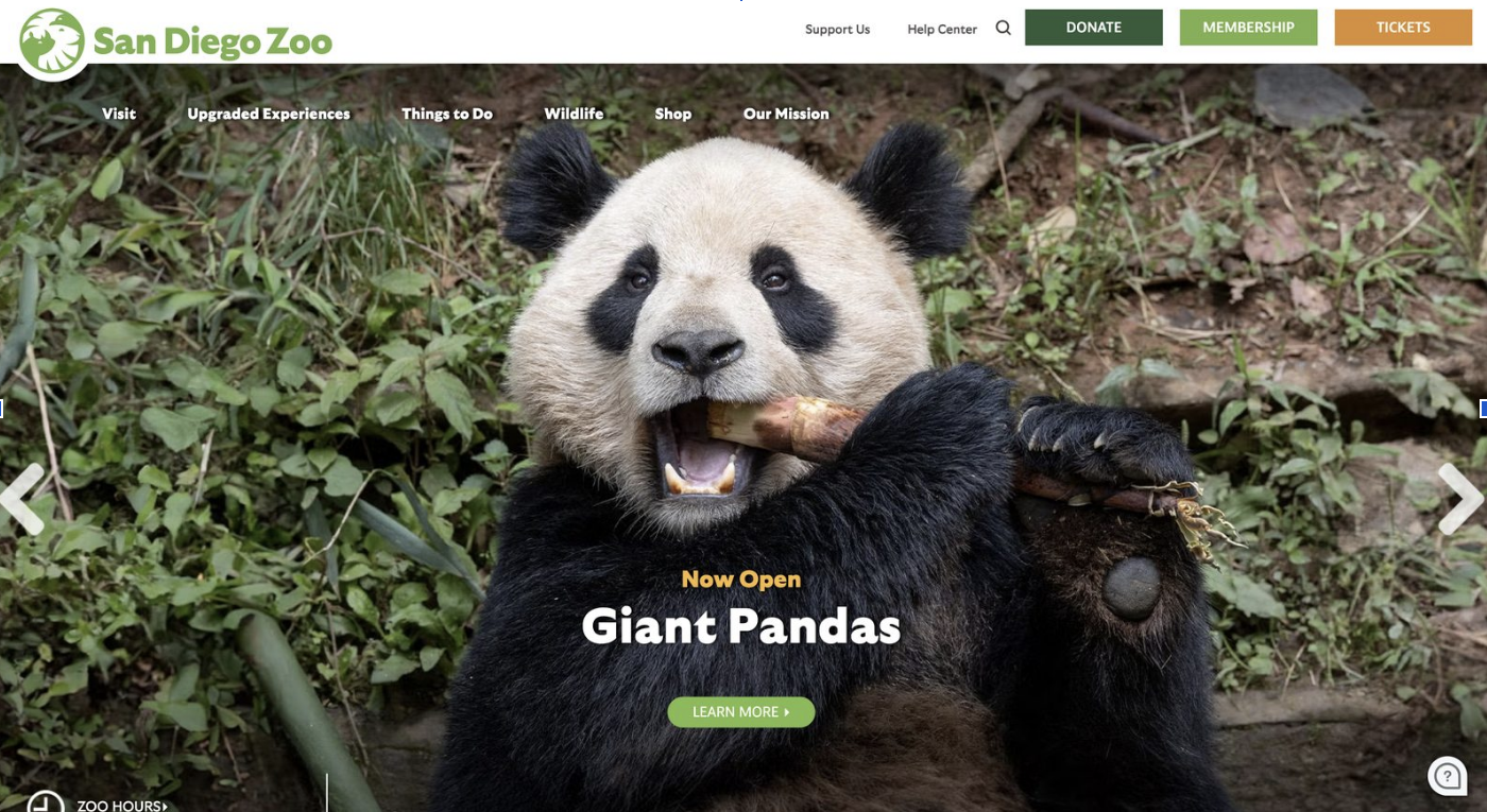
What's most telling about the latest screenshot is how little of it is actually new:
- Unchanged: the circular logo mark from 2021, the single-row navigation, the full-bleed-photo-plus-headline hero pattern.
- One label swap: "Things to Do" became "Upgraded Experiences" — a small but pointed shift toward selling premium add-ons rather than just describing the visit.
- Refinement: a darker green Donate, lighter green Membership, orange Tickets. Drop shadows on text and updated fonts make text stand out and maximize readability
- One new element: a chat-bubble icon in the bottom-right corner, the now-standard signal that live support is a click away
This is the part of the story that's easy to miss if you only compare a site to its distant past: most years, most redesigns aren't dramatic at all. They're maintenance. Once a navigation structure tests well, a hero pattern converts, and a color system photographs consistently across campaigns, the rational move is to keep it and feed it new content rather than tear it down.
The 2016-to-2021 jump was a genuine structural overhaul, triggered by an organizational rebrand. The 2021-to-2026 stretch, despite covering the same five years, looks almost like a single continuous site with a rotating cast of photographs. The focus in these last five years is less about huge changes and more about refinement to retain site visitors with easy readability and clear navigation.
What This One Page Says About the Rest of the Web
None of these shifts are unique to a zoo:
- Flatter navigation spread across sites over the same period, largely because mobile traffic forced every extra menu tier to justify itself on a six-inch screen.
- Full-bleed documentary photography replaced composited stock-photo heroes because better cameras and UX research both pointed the same direction.
- Conistent Call-To-Action palettes reflect the broader maturation of design systems as a practice. Most organizations now maintain a documented palette and component library instead of letting each campaign invent its own button.
What the zoo's case shows especially clearly is the uneven pace at which this happens. Change doesn't arrive on a schedule; it arrives when something forces the issue, and then it holds until the next thing forces it again.
The View Is Different From Inside the Building
We noticed all of this partly because it happened to us. 3P Marketing built its own site four years ago, and until recently nobody on our team would have called it outdated. Nothing was broken, the copy still held up, the brand colors were still ours. It just quietly stopped looking like the work we ship for clients today.
We saw it every day, which is exactly why we stopped seeing it.
That's the pattern worth taking from this whole exercise: design standards change gradually. When you see your site every day you may not realize just when its becomes outdated.
A few questions worth asking about your own site, borrowed straight from what changed on the zoo's:
- How many navigation tiers does a visitor have to parse before they find what they came for? If it's more than one row, ask why.
- Is your hero an image with a purpose, or a composite doing several jobs at once?
- Do your call-to-action buttons share one visual language, or did each one get designed in isolation, campaign by campaign?
- Are there widgets, banners, or badges still on the page because removing them feels riskier than leaving them?’
If reading through this blog made you wonder about your own homepage and if it may have become outdated without you ever realizing, let's talk! Schedule a call with 3P Marketing today!